These notes have been adapted from Compose layout basics.
It may seem counter-intuitive to create a user interface out of functions, rather than out of tags like you are used to with markup languages like HTML. Where are the components rendered on a screen? How can we control the “flow” of the interface?
This lecture focuses on the layout of @Composable functions, explaining some of the building blocks Compose provides to help you lay out your UI elements.
Review from last lecture: @Composable functions are the basic building block of Compose. A composable function is a function emitting Unit that describes some part of your UI. The function takes some input and generates what’s shown on the screen.
A single @Composable function can emit several UI elements. In the ArtistCard function below, two Text elements are generated:
@Composablefun ArtistCard() { Text("Alfred Sisley") Text("3 minutes ago")}@Composablefun ArtistCard() { Text("Alfred Sisley") Text("3 minutes ago")}
Compose does not handle layout automatically, and may arrange the elements in a way you don’t like. In the above example, Compose stacks the text elements on top of eachother, making them unreadable.
The reason this happens is that the ArtistCard() function has the instruction to draw two Text elements, but does NOT have instructions about the location those elements should be drawn.
Compose comes built-in with a variety of layout components that we can use. We can then compose these elements to define our own layouts.
Application user interfaces are (mostly) two dimensional, and made up of “boxes”. The easiest way to fix the ArtistCard(), then, is to arrange these “boxes” in either a Column or a Row, which are happily built-in for us:
@Composablefun ArtistCardColumn() { Column { Text("Alfred Sisley") Text("3 minutes ago") }}@Composablefun ArtistCardColumn() { Column { Text("Alfred Sisley") Text("3 minutes ago") }}
While using the Row element alone would unravel the stack, it’s not as interesting to place two text elements side-by-side. Instead, we can nest @Composable layout elements to produce more complicated layouts, such as a Column within a Row:
@Composablefun ArtistCardRow(artist: Artist) { Row(verticalAlignment = Alignment.CenterVertically) { Image(bitmap = artist.image, contentDescription = "Artist image") Column { Text(artist.name) Text(artist.lastSeenOnline) } }}@Composablefun ArtistCardRow(artist: Artist) { Row(verticalAlignment = Alignment.CenterVertically) { Image(bitmap = artist.image, contentDescription = "Artist image") Column { Text(artist.name) Text(artist.lastSeenOnline) } }}
Note: this example, and many following examples, make use of the Image builtin @Composable. Like other @Composable elements, Image returns a Kotlin Unit and takes an optional Modifier parameter, as well a non-optional Painter which specifies what image/thing to draw in the Image element. See Working with Images for more information and examples.
Finally, the Box element allows you to control how elements are stacked upon eachother, allowing you to create stacks of elements where overlap is desired:
@Composablefun ArtistAvatar(artist: Artist) { Box { Image(bitmap = artist.image, contentDescription = "Artist image") Icon(Icons.Filled.Check, contentDescription = "Check mark") }}@Composablefun ArtistAvatar(artist: Artist) { Box { Image(bitmap = artist.image, contentDescription = "Artist image") Icon(Icons.Filled.Check, contentDescription = "Check mark") }}
Note: In this result, the “Artist Image” seems to be centered, while the “Check mark” Icon seems to be bottom-right aligned. I’m not really sure if the example code I’ve provided will have this exact behavior, I didn’t try it myself. The next section makes alignment customizations more clear.
The primary layout components Column, Row, and Box are expressive and powerful in combination, and are often all you need to create complex layouts. You can write your own composable function to combine these layouts into a more elaborate layout that suits your app.
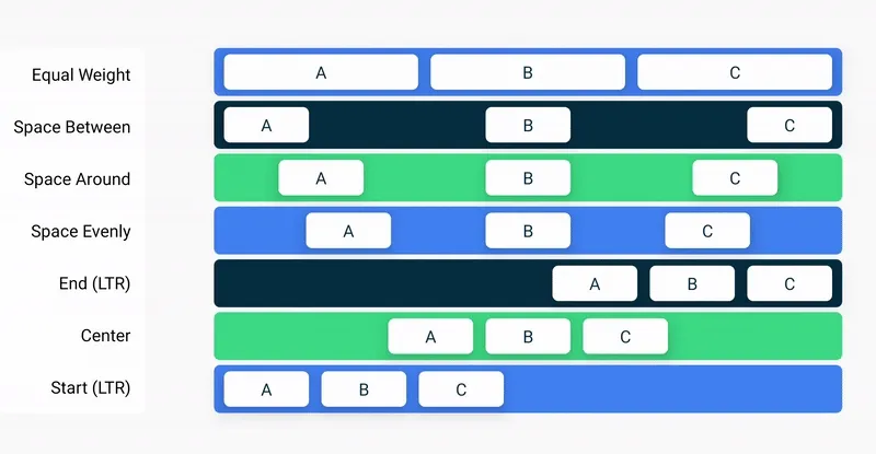
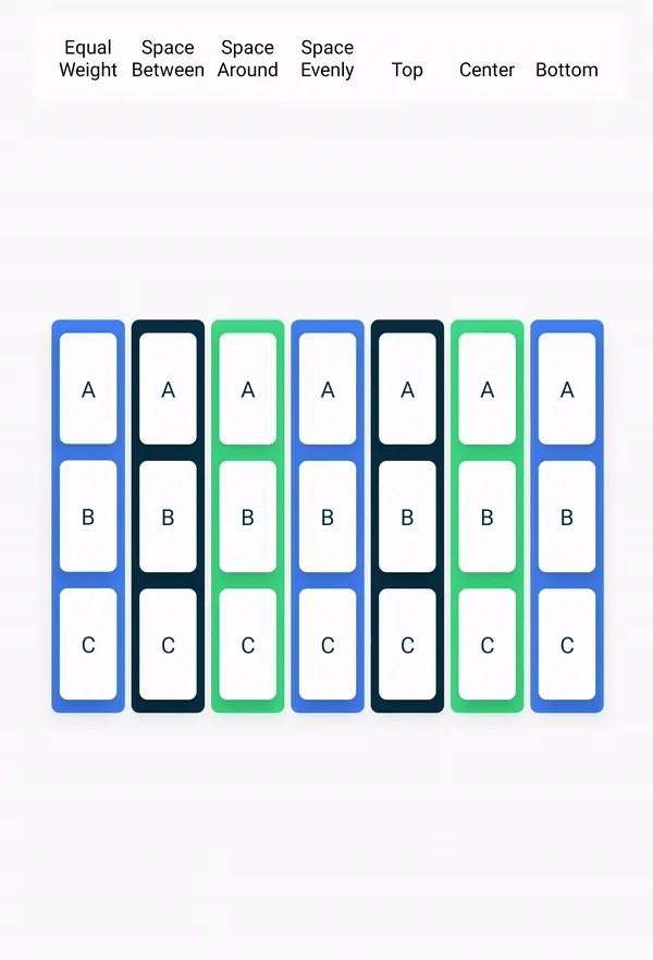
So far, it appears as though Jetpack Compose centers elements horizontally and vertically within their containers. This is pretty nice default behavior, but it would be nicer if we could control it — so of course, we can. We can see some useful parameters for this by taking a look at the definitions for each of Row, Column, and Box:
@Composableinline fun Row( modifier: Modifier = Modifier, horizontalArrangement: Arrangement.Horizontal = Arrangement.Start, verticalAlignment: Alignment.Vertical = Alignment.Top, content: @Composable RowScope.() -> Unit): Unit@Composableinline fun Row( modifier: Modifier = Modifier, horizontalArrangement: Arrangement.Horizontal = Arrangement.Start, verticalAlignment: Alignment.Vertical = Alignment.Top, content: @Composable RowScope.() -> Unit): Unit@Composableinline fun Column( modifier: Modifier = Modifier, verticalArrangement: Arrangement.Vertical = Arrangement.Top, horizontalAlignment: Alignment.Horizontal = Alignment.Start, content: @Composable ColumnScope.() -> Unit): Unit@Composableinline fun Column( modifier: Modifier = Modifier, verticalArrangement: Arrangement.Vertical = Arrangement.Top, horizontalAlignment: Alignment.Horizontal = Alignment.Start, content: @Composable ColumnScope.() -> Unit): Unit@Composableinline fun Box( modifier: Modifier = Modifier, contentAlignment: Alignment = Alignment.TopStart, propagateMinConstraints: Boolean = false, content: @Composable BoxScope.() -> Unit): Unit@Composableinline fun Box( modifier: Modifier = Modifier, contentAlignment: Alignment = Alignment.TopStart, propagateMinConstraints: Boolean = false, content: @Composable BoxScope.() -> Unit): UnitTo set children’s position within a Row, set the horizontalArrangement and verticalAlignment arguments. For a Column, set the verticalArrangement and horizontalAlignment arguments.
Below follow some of the possible arguments for each, and their effects. You can see the range of possible Alignments and Arrangments by clicking on these corresponding links.
These notes have been adapted from Custom layouts in Compose.
As we have seen, UI elements in Compose are represented by the @Composable functions that emit a piece of UI when invoked. Since composables are functions, each composable can call other composable functions within their function body, allowing us to define nested UI structres. Behind the scenes, these composable UI elements are added to a UI tree that gets rendered on the screen. How is this “tree” modeled?
Each UI element has one parent and zero to many children. Each element is also located within its parent, specified as an (x, y) position, and a size, specified as a width and a height.
That is, parent elements define the constraints for their child elements, while child elements take up the space made available to them by their parent.
Constraints restrict the minimum and maximum width and height of an element. If an element has child elements, it may measure each child to help determine its own size (and may even expand to make more room, if that parent has room to expand). Once an element determines and reports its own size, it defines how to place its child elements relative to itself.
Laying out each node in the UI tree is therefore a three step process. Each node must:
- Measure any children
- Decide its own size
- Place its children
Since UI is a tree structure, an initial render of the UI recursively performs this three-step process on all nodes. Afterwards, nodes are lazily recomposed whenever there are UI changes, ensuring that only nodes which require updates are rerendered.
We’ll see in the Layout modifiers section how you can use the layout model to customize these behaviors in Compose.
These notes have been adapted from Compose modifiers and API Guidelines for Jetpack Compose.
Modifiers allow you to decorate or augment a composable. Modifiers let you do these sorts of things:
- Change the composable’s size, layout, behavior, and appearance
- Add information, like accessibility labels
- Process user input
- Add high-level interactions, like making an element clickable, scrollable, draggable, or zoomable
Modifiers are standard Kotlin objects. Create a modifier by calling one of the Modifier class functions:
@Composableprivate fun Greeting(name: String) { Column(modifier = Modifier.padding(24.dp)) { Text(text = "Hello,") Text(text = name) }}@Composableprivate fun Greeting(name: String) { Column(modifier = Modifier.padding(24.dp)) { Text(text = "Hello,") Text(text = name) }}Modifier functions are factory extension functions on Modifier, (that is, each of these extention functions returns a modified Modifer) allowing us to chain Modifier function class for combined effects:
@Composableprivate fun Greeting(name: String) { Column( modifier = Modifier .padding(24.dp), .fillMaxWidth() ) { Text(text = "Hello,") Text(text = name) }}@Composableprivate fun Greeting(name: String) { Column( modifier = Modifier .padding(24.dp), .fillMaxWidth() ) { Text(text = "Hello,") Text(text = name) }}
In the code above, notice different modifier functions used together.
paddingputs space around an element.fillMaxWidthmakes the composable fill the maximum width given to it from its parent.
All the @Composables your write should accept an optional modifier parameter, and pass that modifier to its first child that emits UI. Doing so makes your code more reusable and makes its behavior more predictable and intuitive:
@Composablefun FancyButton( text: String, onClick: () -> Unit, modifier: Modifier = Modifier // Optional parameter (has a default argument)) = Text( text = text, modifier = modifier.surface(elevation = 4.dp) // modifier passed to child (with customizations) .clickable(onClick) .padding(horizontal = 32.dp, vertical = 16.dp))@Composablefun FancyButton( text: String, onClick: () -> Unit, modifier: Modifier = Modifier // Optional parameter (has a default argument)) = Text( text = text, modifier = modifier.surface(elevation = 4.dp) // modifier passed to child (with customizations) .clickable(onClick) .padding(horizontal = 32.dp, vertical = 16.dp))Modifiers are the standard means of adding external behavior and customizations to an element in Compose. Through the Modifier parameter, we don’t have to worry about defining common behavior/customizations for each @Composable we create. This allows element APIs to be smaller and more focused, as Modifiers are used to decorate those elements with standard behavior.
A best practise is for the Modifier to occupy the first optional parameter slot in a @Composable. This sets a consistent expectation for developers: they can always provide a modifier as the final positional parameter to an element call for any given element’s common case.
For more information, see the Compose API guidelines, Elements accept and respect a Modifier parameter.
The order of modifier functions in a chain of calls is significant. Since each function makes changes to the Modifier returned by the previous function, the sequence order affects the final result. Let’s see an example of this:
@Composablefun ArtistCard(/*...*/) { val padding = 16.dp Column( Modifier .clickable(onClick = onClick) .padding(padding) .fillMaxWidth() ) { // rest of the implementation }}@Composablefun ArtistCard(/*...*/) { val padding = 16.dp Column( Modifier .clickable(onClick = onClick) .padding(padding) .fillMaxWidth() ) { // rest of the implementation }}
Note: the “padding” here is the small white band that encompasses the entire @Composable (above the title, below the image, etc.)
In the code above the whole area is clickable, including the surrounding padding, because the padding modifier has been applied after the clickable modifier. If the modifiers order is reversed, the space added by padding does not react to user input:
@Composablefun ArtistCard(/*...*/) { val padding = 16.dp Column( Modifier .padding(padding) .clickable(onClick = onClick) .fillMaxWidth() ) { // rest of the implementation }}@Composablefun ArtistCard(/*...*/) { val padding = 16.dp Column( Modifier .padding(padding) .clickable(onClick = onClick) .fillMaxWidth() ) { // rest of the implementation }}
The explicit ordering of Modifier chains helps developers create predictable and controllable outcomes from a variety of Modifier combinations.
Jetpack Compose provides a list of built-in modifiers to help you decorate or augment a composable. Here are some common modifiers you’ll use to adjust your layouts.
By default, layouts provided in Compose wrap their children. However, you can set a size by using the size modifier:
@Composablefun ArtistCard(/*...*/) { Row( modifier = Modifier.size(width = 400.dp, height = 100.dp) ) { Image(/*...*/) Column { /*...*/ } }}@Composablefun ArtistCard(/*...*/) { Row( modifier = Modifier.size(width = 400.dp, height = 100.dp) ) { Image(/*...*/) Column { /*...*/ } }}Note that the size you specified might not be respected if it does not satisfy the constraints coming from the layout’s parent (see the layout model. If you require the composable size to be fixed regardless of the incoming constraints, use the requiredSize modifier:
@Composablefun ArtistCard(/*...*/) { Row( modifier = Modifier.size(width = 400.dp, height = 100.dp) ) { Image( /*...*/ modifier = Modifier.requiredSize(150.dp) ) Column { /*...*/ } }}@Composablefun ArtistCard(/*...*/) { Row( modifier = Modifier.size(width = 400.dp, height = 100.dp) ) { Image( /*...*/ modifier = Modifier.requiredSize(150.dp) ) Column { /*...*/ } }}In this example, even with the parent height set to 100.dp, the height of the Image will be 150.dp, as the requiredSize modifier takes precedence.
If you want a child layout to fill all the available height allowed by the parent, add the fillMaxHeight modifier (Compose also provides fillMaxSize and fillMaxWidth):
@Composablefun ArtistCard(/*...*/) { Row( modifier = Modifier.size(width = 400.dp, height = 100.dp) ) { Image( /*...*/ modifier = Modifier.fillMaxHeight() ) Column { /*...*/ } }}@Composablefun ArtistCard(/*...*/) { Row( modifier = Modifier.size(width = 400.dp, height = 100.dp) ) { Image( /*...*/ modifier = Modifier.fillMaxHeight() ) Column { /*...*/ } }}To add padding all around an element, set a padding modifier.
If you want to add padding above a text baseline such that you achieve a specific distance from the top of the layout to the baseline, use the paddingFromBaseline modifier:
@Composablefun ArtistCard(artist: Artist) { Row(/*...*/) { Column { Text( text = artist.name, modifier = Modifier.paddingFromBaseline(top = 50.dp) ) Text(artist.lastSeenOnline) } }}@Composablefun ArtistCard(artist: Artist) { Row(/*...*/) { Column { Text( text = artist.name, modifier = Modifier.paddingFromBaseline(top = 50.dp) ) Text(artist.lastSeenOnline) } }}To position a layout relative to its original position, add the offset modifier and set the offset in the x and y axis. Offsets can be positive as well as non-positive. The difference between padding and offset is that adding an offset to a composable does not change its measurements:
@Composablefun ArtistCard(artist: Artist) { Row(/*...*/) { Column { Text(artist.name) Text( text = artist.lastSeenOnline, modifier = Modifier.offset(x = 4.dp) ) } }}@Composablefun ArtistCard(artist: Artist) { Row(/*...*/) { Column { Text(artist.name) Text( text = artist.lastSeenOnline, modifier = Modifier.offset(x = 4.dp) ) } }}The offset modifier is applied horizontally according to the layout direction — by default, shifting an element to the right; but shifting an element to the left in a right-to-left context (see link for more detail).
See “Use the layout modifier” on the Developer Android docs. (notes to be updated soon.)
In Compose, there are modifiers that can only be used when applied to children of certain composables. Compose enforces this by means of custom scopes.
For example, if you want to make a child as big as the parent Box without affecting the Box size, use the matchParentSize modifier. matchParentSize is only available in BoxScope. Therefore, it can only be used on a child within a Box parent.
As mentioned above, if you want a child layout to be the same size as a parent Box without affecting the Box size, use the matchParentSize modifier.
Note that matchParentSize is only available within a Box scope, meaning that it only applies to direct children of Box composables.
In the example below, the child Spacer takes its size from its parent Box, which in turn takes its size from the biggest children, ArtistCard in this case.
fun MatchParentSizeComposable() { Box { Spacer( Modifier .matchParentSize() // .fillMaxSize() .background(Color.LightGray) ) ArtistCard() }}fun MatchParentSizeComposable() { Box { Spacer( Modifier .matchParentSize() // .fillMaxSize() .background(Color.LightGray) ) ArtistCard() }}

As you have seen in the previous section, by default, a composable size is defined by the content it is wrapping (i.e. by the size of its children). You can set a composable size to be flexible within its parent using the weight Modifier that is only available in RowScope and ColumnScope.
Let’s take a Row that contains two Box composables. The first box is given twice the weight of the second, so it’s given twice the width. Since the Row is 210.dp wide, the first Box is 140.dp wide, and the second is 70.dp:
@Composablefun ArtistCard(/*...*/) { Row( modifier = Modifier.fillMaxWidth() ) { Image( /*...*/ modifier = Modifier.weight(2f) ) Column( modifier = Modifier.weight(1f) ) { /*...*/ } }}@Composablefun ArtistCard(/*...*/) { Row( modifier = Modifier.fillMaxWidth() ) { Image( /*...*/ modifier = Modifier.weight(2f) ) Column( modifier = Modifier.weight(1f) ) { /*...*/ } }}
Multiple modifiers can be chained together to decorate or augment a composable. This chain is created via the Modifier interface which represents an ordered, immutable list of single Modifier.Elements
Create your own Modifier chains and extract them to reuse them on multiple composable components. It is completely fine to just save a modifier, as they are data-like objects:
val reusableModifier = Modifier .fillMaxWidth() .background(Color.Red) .padding(12.dp)val reusableModifier = Modifier .fillMaxWidth() .background(Color.Red) .padding(12.dp)Each Modifier.Element represents an individual behavior, like layout, drawing and graphics behaviors, all gesture-related, focus and semantics behaviors, as well as device input events. Their ordering matters: modifier elements that are added first will be applied first.
Sometimes it can be beneficial to reuse the same modifier chain instances in multiple composables, by extracting them into variables and hoisting them into higher scopes. It can improve code readability or help improve your app’s performance for a few reasons:
- The re-allocation of the modifiers won’t be repeated when recomposition occurs for composables that use them
- Modifier chains could potentially be very long and complex, so reusing the same instance of a chain can alleviate the workload Compose runtime needs to do when comparing them
- This extraction promotes code cleanliness, consistency and maintainability across the codebase
You can see a complete set of best practises for reusing modifiers by following the link.